677 Messages
•
44.6K Points
WebsiteBuilder: Navigation Menu
A navigation menu is crucial to the success of your site. It lets your visitors know what is available on your site, allows them to move throughout your website, and helps search engines crawl all pages you have linked in the menu.
It is important to keep your menu as uncomplicated and easy to use as possible. It is recommended to have no more than 15 items in your pages menu, because more than that tends to overwhelm a person viewing your site.
Best practices for navigation menus include putting it toward the top of your pages, keeping the menu in the same place on each page, and making sure the menu is visible on all pages. This will provide the best experience for your visitors. Also, it should take no more than 2-3 clicks for a customer to get somewhere on your site. Making it easier for your customer to navigate your site will make it more likely for them to stay on your site, decreasing the bounce rate.
Basically, the navigation menu is like a map you give customers to help them find what they need on your website. The better you make your map, the easier your visitors will find it to explore the content you provide.
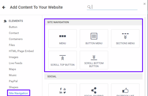
In Website Builder, there is a category under Elements specifically for Site Navigation:
1) When you choose Menu:
The menu will be attached to your cursor for you to place where you choose to have it on your site.
Once it is placed, you will see a menu that gives you the option to Manage Pages, along with several other icons. You can see what these icons are for by hovering over them with your mouse.
To see a more in depth menu, click More > Advanced.

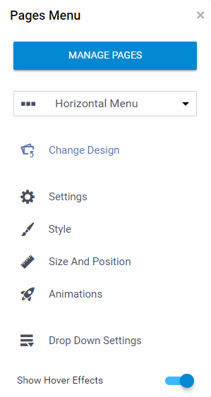
A secondary menu will appear on the right with the following options:
If you click:
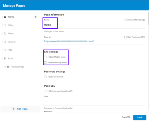
Manage Pages- It will open up the Page Settings, and you can edit page names, hide pages, and choose your Home page. Any page you have on your site, unless hidden, will appear as the links for your menu. You cannot link buttons on your menu to 3rd party site links.
Menu Layout- You will be able to choose from a Menu Button, Horizontal Menu, Vertical Menu, or Grid Menu
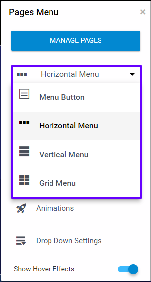
Change Design- This will pull up the different types of menu designs you can choose from. This includes bars, buttons, text links, and more. You will just need to choose which design works best with the design of your site. Once you choose one, click Apply in the top right.
Settings- You can choose what you want to say to indicate more options, whether to show an arrow or not for drop down menus, how many menu items display, and the spacing for your menu items.
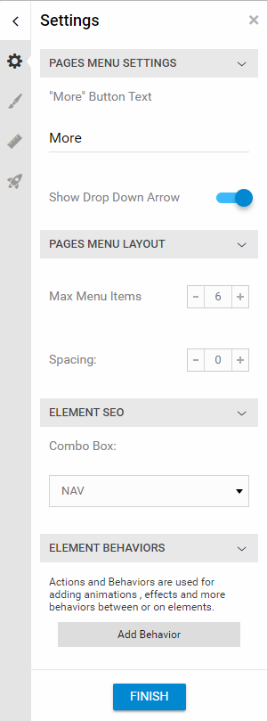
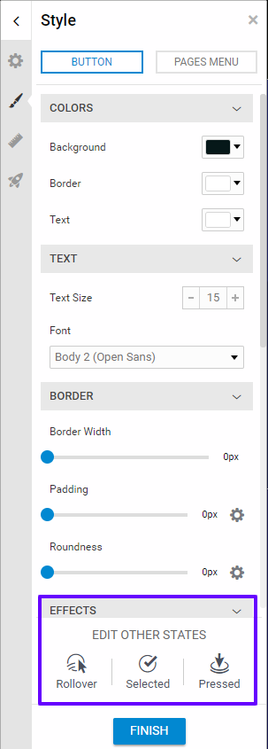
Style- This is where you design your menu. Choose the color, background, border, and other style options from this menu. At the top of this menu, there is an option to choose Pages Menu or Button. Once you have designed your menu, click on Button to change the style for the individual links. From this Button section of the Style Menu, you can also edit the different states of the button like Rollover, Selected, and Pressed.
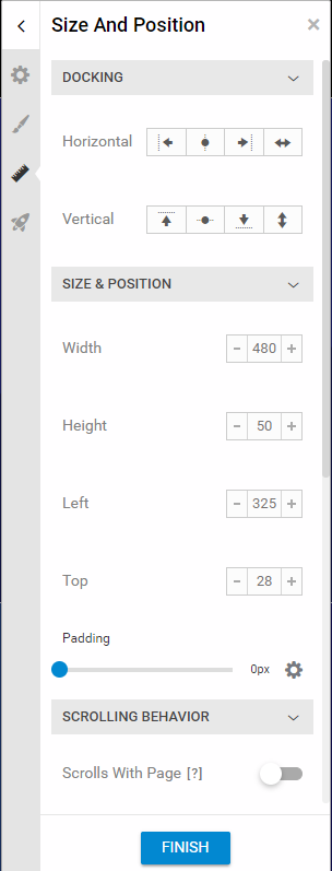
Size and Position- This is where you can use Docking. You can Center your menu in that section horizontally or vertically. You can also stretch is horizontally or vertically, or dock it to the left, right, top or bottom of the section. You can also change the size of your navigation menu box from here.
Animations- This allows you to add effects to your menu like bounce or fly in.
Drop Down Settings- This will allow you to customize the style and settings for any drop down menus you create.
You create these sub-menus by moving a page underneath another page in the Page Settings.
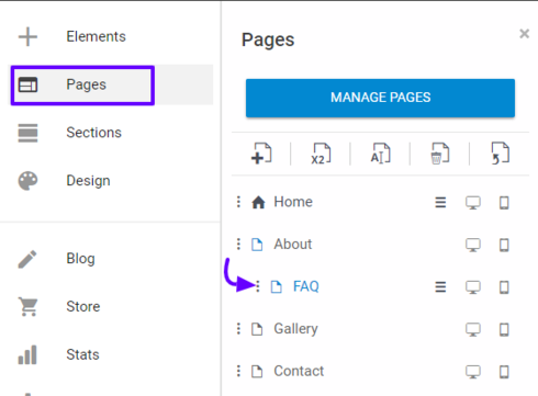
**Note- You can only have one Navigation Menu. If you need additional links, you will need to create them manually using buttons.
2) When you choose Button Menu:
It will appear as a mobile menu icon

3) When you choose Sections Menu:
It will have a menu attached to your cursor that you can place on your page. This will allow customers to navigate to the different sections on the current page. This is especially helpful for very long pages, or pages with a lot of content. You can only have one Navigation Menu for your site, but you can have a different Sections Menu for each page.

The last two options are fairly self explanatory:
Place a Scroll Top Button to allow visitors to jump to the top of your page.

Place a Scroll Bottom Button to allow visitors to jump to the bottom of your page.

It is important to keep your menu as uncomplicated and easy to use as possible. It is recommended to have no more than 15 items in your pages menu, because more than that tends to overwhelm a person viewing your site.
Best practices for navigation menus include putting it toward the top of your pages, keeping the menu in the same place on each page, and making sure the menu is visible on all pages. This will provide the best experience for your visitors. Also, it should take no more than 2-3 clicks for a customer to get somewhere on your site. Making it easier for your customer to navigate your site will make it more likely for them to stay on your site, decreasing the bounce rate.
Basically, the navigation menu is like a map you give customers to help them find what they need on your website. The better you make your map, the easier your visitors will find it to explore the content you provide.
In Website Builder, there is a category under Elements specifically for Site Navigation:
1) When you choose Menu:
The menu will be attached to your cursor for you to place where you choose to have it on your site.
Once it is placed, you will see a menu that gives you the option to Manage Pages, along with several other icons. You can see what these icons are for by hovering over them with your mouse.
To see a more in depth menu, click More > Advanced.
A secondary menu will appear on the right with the following options:
- Manage Pages
- Menu Layout
- Change Design
- Settings
- Style
- Size and Position
- Animations
- Drop Down Settings
If you click:
Manage Pages- It will open up the Page Settings, and you can edit page names, hide pages, and choose your Home page. Any page you have on your site, unless hidden, will appear as the links for your menu. You cannot link buttons on your menu to 3rd party site links.
Menu Layout- You will be able to choose from a Menu Button, Horizontal Menu, Vertical Menu, or Grid Menu
Change Design- This will pull up the different types of menu designs you can choose from. This includes bars, buttons, text links, and more. You will just need to choose which design works best with the design of your site. Once you choose one, click Apply in the top right.
Settings- You can choose what you want to say to indicate more options, whether to show an arrow or not for drop down menus, how many menu items display, and the spacing for your menu items.
Style- This is where you design your menu. Choose the color, background, border, and other style options from this menu. At the top of this menu, there is an option to choose Pages Menu or Button. Once you have designed your menu, click on Button to change the style for the individual links. From this Button section of the Style Menu, you can also edit the different states of the button like Rollover, Selected, and Pressed.
Size and Position- This is where you can use Docking. You can Center your menu in that section horizontally or vertically. You can also stretch is horizontally or vertically, or dock it to the left, right, top or bottom of the section. You can also change the size of your navigation menu box from here.
Animations- This allows you to add effects to your menu like bounce or fly in.
Drop Down Settings- This will allow you to customize the style and settings for any drop down menus you create.
You create these sub-menus by moving a page underneath another page in the Page Settings.
**Note- You can only have one Navigation Menu. If you need additional links, you will need to create them manually using buttons.
2) When you choose Button Menu:
It will appear as a mobile menu icon
3) When you choose Sections Menu:
It will have a menu attached to your cursor that you can place on your page. This will allow customers to navigate to the different sections on the current page. This is especially helpful for very long pages, or pages with a lot of content. You can only have one Navigation Menu for your site, but you can have a different Sections Menu for each page.
The last two options are fairly self explanatory:
Place a Scroll Top Button to allow visitors to jump to the top of your page.
Place a Scroll Bottom Button to allow visitors to jump to the bottom of your page.


hal9944
61 Messages
•
1.2K Points
6 years ago
4
0
hal9944
61 Messages
•
1.2K Points
6 years ago
This is really an incredible improvement over SB+ but I seem to be running into road blocks everywhere. I'm using a Sections Menu (one page, 8 sections), but it doesn't show up on the mobile site, How do you navigate the mobile site without a menu? How do you work around this?
10
0
heather4091
15 Messages
•
420 Points
6 years ago
1
0
hal9944
61 Messages
•
1.2K Points
6 years ago
1
0
tanya1242
44 Messages
•
832 Points
4 years ago
It does not show hoe to create the links. Difficult to use!!
2
0